Why Dark-Mode Design Converts Better
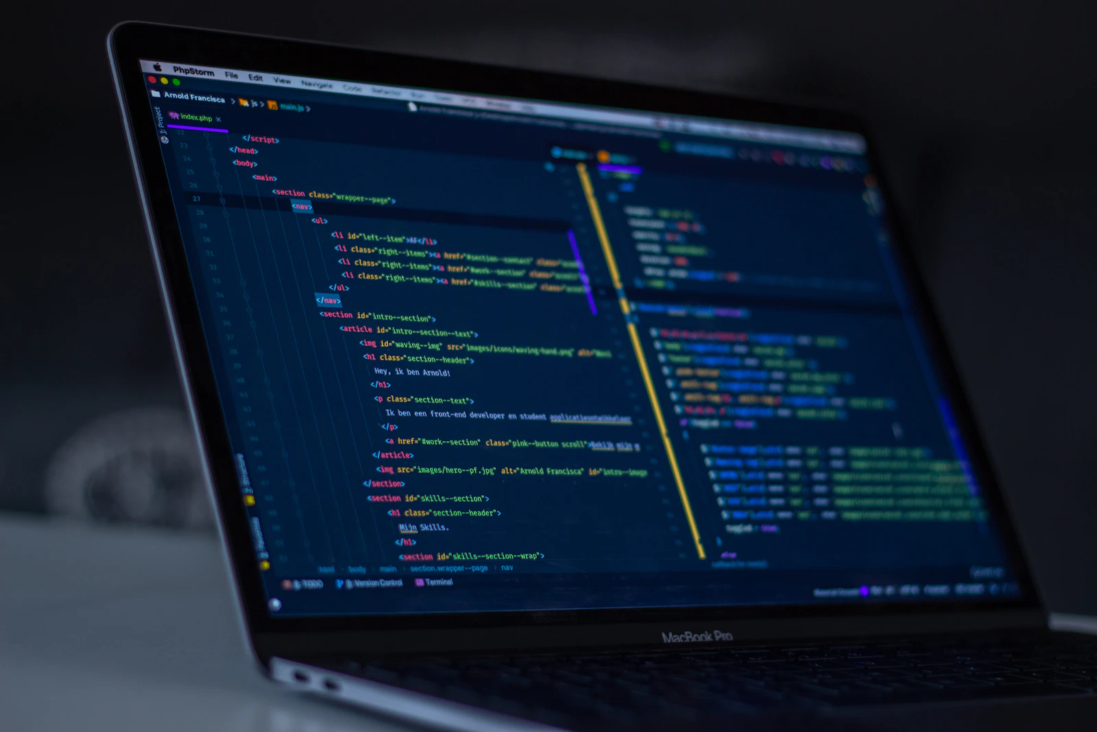
Dark interfaces get dismissed as a trend, but the mechanics behind why they work are pretty concrete.
Contrast does the heavy lifting. On a dark background, a single bright accent color reads as urgent and important almost automatically — you don't need bigger buttons or louder copy, just the right amount of restraint everywhere else.
It also changes how photography reads. Product shots and portraits gain a kind of gallery quality against near-black — the image becomes the color story instead of competing with a busy white canvas.
The catch is legibility. Dark mode done badly is just hard to read. That means real contrast ratios on body text, muted (not pure white) foreground colors to cut eye strain, and enough breathing room that the page doesn't feel heavy. Get that right, and dark stops being a mood — it becomes a conversion tool.