Typography Tips for a Moody Brand
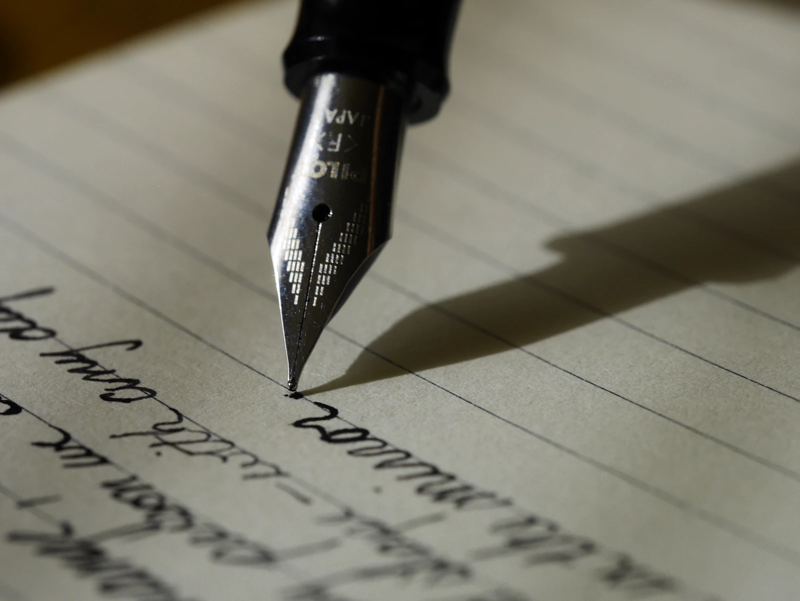
On a light background, type can hide behind color and imagery. On a dark one, it can't — type is doing more of the emotional work, so the choice matters more.
A serif with real personality (a high-contrast display serif, an italic with some swing to it) paired against a clean, quiet sans for body copy is a reliable formula. The serif carries mood; the sans carries information.
Size and spacing matter more than people expect. Tight, oversized display type against generous whitespace reads as confident. The same type crammed into a small box just reads as cramped, dark background or not.
And don't skip the details — italics, small caps for eyebrows and labels, a slightly wider tracking on all-caps text. On a dark canvas those small typographic flourishes are what make a page feel designed rather than assembled.